TLDR: Use Firebase Authentication, Firebase Firestore and Firebase Storage to store a feedback object and accompanying attachments. Build a good looking, accessible form for users and then create a Firebase Cloud Function to notify you when users submit feedback.
Welcome! Today I'm going to show you how to build a feedback component that you can integrate with your Firebase project to start getting bug reports and feature suggestions. This won't be just any old feedback tool though. It will also allow users to categorize their feedback and add attachments. Check out the demo below to see what I mean 😊
🚀 See the demo here
💻 See the code on GitHub
This is a rather long tutorial if you're starting from scratch. I'm going to include the necessary instructions but it's more likely that you will be integrating this into your existing project. Since your project will look slightly different than mine, you may have to adapt some instructions to fit your project.
Why did I build this?
I spent over half of 2020 building Relar, a cloud based music hosting + streaming service. One of my priorities was simplifying the feedback process so that beta users could send me bug reports and let me know what features Relar was missing.
I looked for solutions online and found several products that fit my needs. Out of all of the existing solutions, Feedback Fish looked the most stylish and easy to use. The only issue was the price. Although Feedback Fish was cheap, Relar was just a side project and not likely to have any revenue. That being said, getting feedback from users was still important to me so I decided to build something myself 😎
Prerequisites
Since you're still reading this article, I assume this is something that you want to integrate into your project. If you do have an existing project, this tutorial will only really be relevant to you if you are using Firebase, including Firebase Authentication, Firestore and Firebase Storage. I also use React, TypeScript and Tailwind CSS. You don't necessarily have to have the exact same tech stack (e.g. it's totally OK to be using JavaScript rather than TypeScript) but you may have to convert some code to fit your project (e.g. you may have to remove TypeScript types). Also, if you aren't familiar with Tailwind CSS, I would recommend checking out their documentation to understand how utility CSS works.
Project Setup (Optional)
For those you don't have a project yet, follow these steps to get a Firebase + TypeScript + React + Tailwind CSS project bootstrapped. If you already already have a Firebase project, you can either skip to the Data Design section or skim through the following steps to ensure your project has everything it needs. I will be using Snowpack, my frontend build tool of choice, as the development server. This is a rather complex tutorial so I'll assume that you already have node + npm installed.
1. Firebase Setup
The first thing we'll set up is a Firebase project.
- Go to the Firebase Console and click "Add project". Give your project a name, click "Continue", disable Google Analytics and finally "Create project". Sit tight while
Firebaseprovisions your new project. - Under the "Get started by adding Firebase to your app" title, click the coding icon to create a "Web" app. Give your app a nickname and then click "Register app". Skip the "Add Firebase SDK" and "Install Firebase CLI" steps by clicking "Next" and then click "Continue to console" on the final step.
The "Web" button used to create a new web app.
- Click on the "Authentication" tab, then click "Get Started". Next, click on "Email/Password", toggle the "Enable" button to turn on email and password authentication and then click "Save".
The "Email/Password" settings with "Enabled" toggled on.
- Go to the "Users" tab and create a test user for yourself.
- In the "Cloud Firestore" tab on the left, click "Create database", then click "Next" (we'll configure the rules later), set the region (or leave the default value) and then click "Enable".
2. Snowpack Template
Like I mentioned above, we'll be using Snowpack as our build tool. Luckily, Snowpack has some nice templates which we can use to quickly bootstrap a React + TypeScript project using the create-snowpack-app CLI. The following command will create a new Snowpack app in a folder called feedback-tool.
npx create-snowpack-app feedback-tool --template @snowpack/app-template-react-typescript
3. Tailwind Setup
Tailwind CSS is a utility CSS framework that we'll be using today to style the feedback tool. If you just want to use regular CSS or something like SCSS, you can skip this step. Otherwise, to get Tailwind installed, you first install the necessary dependencies.
npm install --save-dev tailwindcss@latest postcss@latest postcss-cli@latest autoprefixer@latest @snowpack/plugin-postcss@latest
Make sure to enter into your newly created project directory before running the above command.
Next, create the tailwind.config.js file and postcss.config.js files using the init command.
npx tailwindcss init -p
Then, in snowpack.config.js, add @snowpack/plugin-postcss to the plugins array.
// snowpack.config.js
plugins: [
  '@snowpack/plugin-react-refresh',
  '@snowpack/plugin-dotenv',
  '@snowpack/plugin-typescript',
  '@snowpack/plugin-postcss',
],
Finally, in src/index.css, remove all of the existing CSS and add the following lines.
/* src/index.css */
@tailwind base;
@tailwind components;
@tailwind utilities;
4. Other Dependencies
We'll use a few handy npm packages which you should install now. We'll also install firebase which you definitely need since this is a Firebase tutorial after all.
npm install uuid classnames firebase
npm install --save-dev @types/uuid @types/classnames
5. App Configuration
We need to configure our React app to point at our Firebase project. First, go back to the Firebase console, click on the gear icon in the top left corner, select "Project settings", scroll down to the "Your apps" section, select "Config" under the "Firebase SDK snippet" heading and then copy the code snippet.
My firebase web app configuration found in the "Project settings". Although your app configuration is technically public information (see this Stack Overflow post), it's best to keep your configuration as locked down as possible to prevent abuse.
Next, create a src/firebase.ts file and copy the code below into the file. In the process, replace the firebaseConfig config object with your own configuration.
// src/firebase.ts
import firebase from "firebase/app";
import "firebase/auth";
import "firebase/storage";
import "firebase/firestore";


const firebaseConfig = {
  apiKey: /** SNIP */,
  authDomain: /** SNIP */,
  projectId: /** SNIP */,
  storageBucket: /** SNIP */,
  messagingSenderId: /** SNIP */,
  appId: /** SNIP */,
};

firebase.initializeApp(firebaseConfig);
Finally, in index.tsx, import firebase.ts so that Firebase is configured during import.
// src/index.tsx
import React from "react";
import ReactDOM from "react-dom";
import App from "./App";
import "./index.css";
import "./firebase";

// SNIP
You can also use a .env file to configure your app. See the @snowpack/plugin-dotenv documentation for more information.
6. Auth Provider
We're going to using a React Context to pass down our user information through the component tree. Create a file called src/auth.tsx and add the following code.
// src/auth.tsx
import React, { createContext, useEffect, useState, useContext } from "react";
import firebase from "firebase/app";

export interface AuthContextInterface {
  user: firebase.User | undefined | null;
}

export const AuthContext = createContext<AuthContextInterface>({
  user: undefined,
});

export const AuthProvider = (props: { children?: React.ReactNode }) => {
  const [user, setUser] = useState<firebase.User | null>();

  useEffect(() => {
    return firebase.auth().onAuthStateChanged(setUser);
  }, []);

  return (
    <AuthContext.Provider value={{ user }}>
      {props.children}
    </AuthContext.Provider>
  );
};

export const useAuth = () => {
  return useContext(AuthContext);
};
Next, in src/index.tsx, add the provider component.
// src/index.tsx
import React from "react";
import ReactDOM from "react-dom";
import App from "./App";
import "./index.css";
import "./firebase";
import { AuthProvider } from "./auth";

ReactDOM.render(
  <React.StrictMode>
    <AuthProvider>
      <App />
    </AuthProvider>
  </React.StrictMode>,
  document.getElementById("root")
);
I'm not going to explain the code above since the focus is on the feedback tool. If you want to learn more about Firebase Authentication, check out this LogRocket blog post.
7. Sign Up Form
Since feedback is associated with the user accounts, we'll need a sign up form to test the feedback tool. Copy the component below and place it in src/SignInForm.tsx.
Don't worry that the Button component doesn't exist yet, you'll create it below.
// src/SignInForm.tsx
import React, { useState } from "react";
import { Button } from "./Button";
import firebase from "firebase/app";

export const SignInForm = () => {
  const [email, setEmail] = useState("");
  const [password, setPassword] = useState("");
  const [error, setError] = useState("");
  const [loading, setLoading] = useState(false);

  return (
    <form className="space-y-6 mt-8" action="#" method="POST">
      <div>
        <label
          htmlFor="email"
          className="block text-sm font-medium text-gray-700"
        >
          Email address
        </label>
        <div className="mt-1">
          <input
            value={email}
            onChange={(e) => setEmail(e.target.value)}
            id="email"
            name="email"
            type="email"
            autoComplete="email"
            required
            className="appearance-none block w-full px-3 py-2 border border-gray-300 rounded-md shadow-sm placeholder-gray-400 focus:outline-none focus:ring-indigo-500 focus:border-indigo-500 sm:text-sm"
          />
        </div>
      </div>

      <div>
        <label
          htmlFor="password"
          className="block text-sm font-medium text-gray-700"
        >
          Password
        </label>
        <div className="mt-1">
          <input
            value={password}
            onChange={(e) => setPassword(e.target.value)}
            id="password"
            name="password"
            type="password"
            autoComplete="current-password"
            required
            className="appearance-none block w-full px-3 py-2 border border-gray-300 rounded-md shadow-sm placeholder-gray-400 focus:outline-none focus:ring-indigo-500 focus:border-indigo-500 sm:text-sm"
          />
        </div>
      </div>

      {error && (
        <div className="text-sm p-3 border-2 rounded-lg border-red-400 bg-red-200 text-red-700 mt-3">
          {error}
        </div>
      )}

      <div>
        <Button
          label="Sign in"
          className="w-full"
          loading={loading}
          onClick={async (e) => {
            e.preventDefault();

            setLoading(true);
            try {
              return await firebase
                .auth()
                .signInWithEmailAndPassword(email, password);
            } catch (e) {
              switch (e.code) {
                case "auth/invalid-email":
                case "auth/user-not-found":
                case "auth/wrong-password":
                  setError("Invalid credentials. Please try again!");
                case "auth/network-request-failed":
                  setError("Network error. Please try again!");
                default:
                  console.error(e);
                  setError("Something went wrong. Please try again!");
              }
            } finally {
              setLoading(false);
            }
          }}
        />
      </div>
    </form>
  );
};
Again, I'm not going to go over this auth stuff as the focus is on the feedback tool.
8. Refactor the App
The final step of the project setup is replacing the contents of src/App.ts with the following content.
Don't worry that Feedback and Button don't exist yet, these will be defined below.
// src/App.tsx
import React from "react";
import { useAuth } from "./auth";
import { Button } from "./Button";
import firebase from "firebase/app";
import { Feedback } from "./Feedback";
import { SignInForm } from "./SignInForm";

export default function App() {
  const { user } = useAuth();

  return (
    <div className="h-screen max-w-xl mx-auto flex flex-col justify-center py-12 px-5 text-gray-900">
      {user ? (
        <>
          <Button
            onClick={() => firebase.auth().signOut()}
            className="absolute right-0 top-0 m-5"
            label="Sign Out"
          />
          <Feedback user={user} />
        </>
      ) : (
        <SignInForm />
      )}
    </div>
  );
}
Data Design
Before we get into the implementation details, we need to go over the design of the data structures and determine where the data is going to be stored in Firestore and Firebase Storage. Feedback is going to consist of a category, a body of text and a list of attachments. We'll also store a timestamp so that we know when a user submitted their feedback. Since Firestore documents are limited to 1 MB, we have to store the attachments in Firebase Storage.
The structure of the user feedback can be defined using the following TypeScript type:
type UserFeedback = {
  feedback: string;
  type: "issue" | "idea" | "other";
  createdAt: firebase.firestore.Timestamp;
};
These objects will be stored in user_data/{userId}/feedback/{feedbackId}. We can then store the associated uploads in {userId}/feedback/{feedbackId}/{fileId}. It is very important that the a feedback object and attachments have an identical feedbackId.
Firebase Rules
Now that we've determined the structure of the data, we can implement rules to enforce these structures. Since clients will be interacting with Firestore and Cloud Storage directly, it's super important that you make these rules as strict as possible.
Firestore
In the Firebase Console , go to the "Cloud Firestore" tab on the left, go to the "Rules" tab, select all of the content in the editor, paste the text from below and then click "Publish". These rules ensure that users create feedback only if the user is logged in and the new object only has the createdAt, feedback and type properties. If you want, you can get more creative with your validation rules if you want to perform further verification.
rules_version = '2';
service cloud.firestore {
  match /databases/{database}/documents {
    match /user_data/{userId}/feedback/{feedbackId} {
      allow create: if userId == request.auth.uid && request.resource.data.keys().hasAll(['createdAt', 'feedback', 'type']);
    }
  }
}
The rules should look like this after they've been published
Storage
Do the exact same steps as above except this time edit the rules in the "Storage" tab. These rules allow users to upload files if they are logged in and the file size is lesser or equal to 20 MB. If you wish to change or remove this file size restriction, you'll have to modify the rules here and the code in the Feedback Component.
rules_version = '2';
service firebase.storage {
  match /b/{bucket}/o {
    match /{userId}/feedback/{id}/{fileName} {
      allow create: if request.auth.uid == userId && request.resource.size <= 20 * 1024 * 1024;
    }
  }
}
I highly recommend using the Firebase CLI to deploy updates toFirestore and Cloud Storage rules. This allows you to keep your rules versioned using git.
UI Design
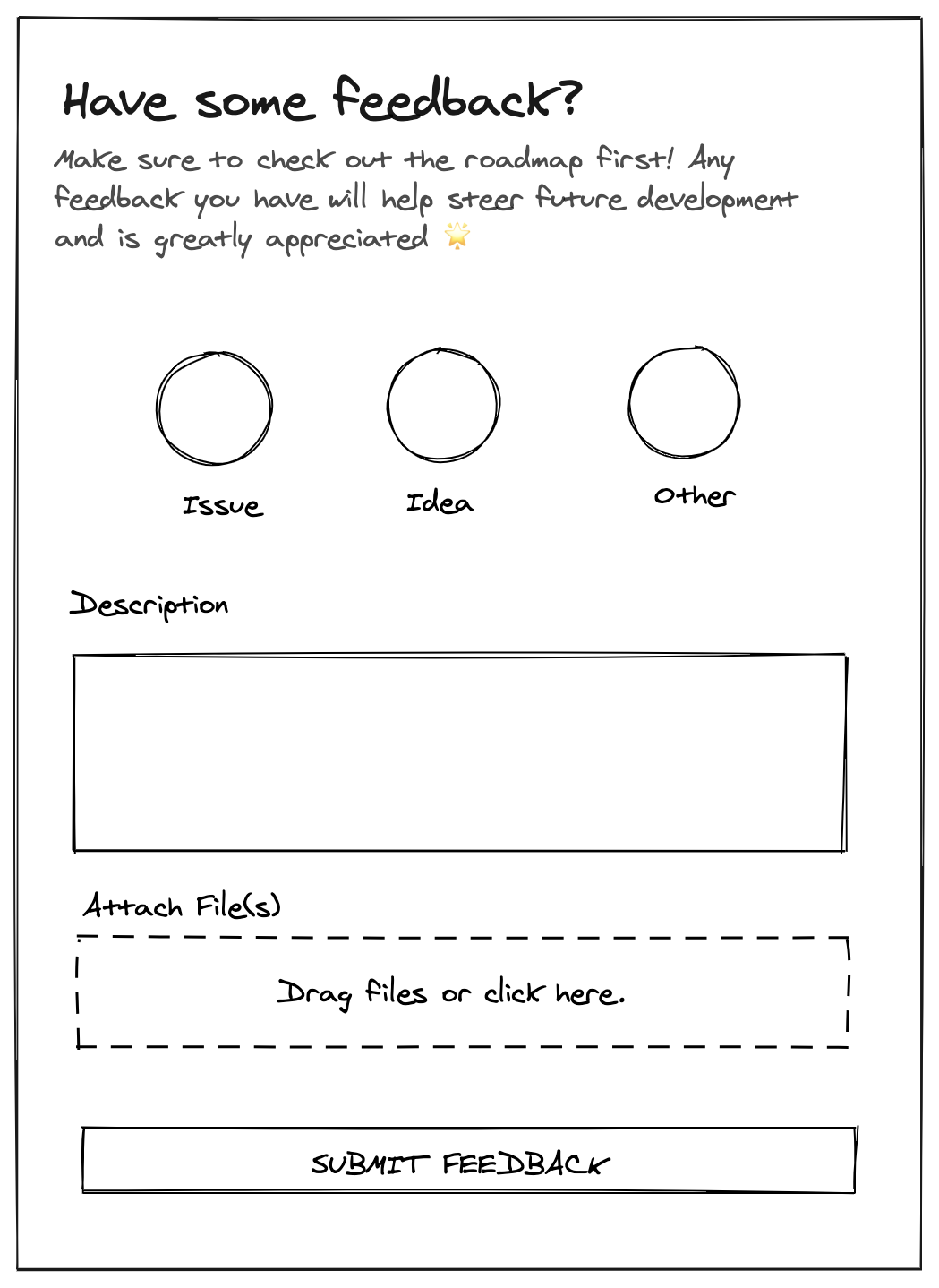
Let's do a quick overview of the design before I get into the code. Below, I've added a sketch that I made using Excalidraw. The design features three different feedback types (Issue, Idea, Other), a textarea for the body of the feedback and an upload section for users to drag files to upload.
Icons
We'll need four icons for this implementation. Three for the radio buttons and one final icon (an airplane) that will be shown to the user after they've successfully submitted their feedback.
If you want to swap out these icons, I highly recommend using Shape.so
1. Issue Icon
Create the "issue" icon at src/IssueIcon.tsx.
// src/IssueIcon.tsx
import React from "react";

export const IssueIcon = ({ className }: { className?: string }) => {
  return (
    <svg
      className={className}
      width="24"
      height="24"
      viewBox="0 0 24 24"
      fill="none"
      xmlns="http://www.w3.org/2000/svg"
    >
      <path
        strokeLinejoin="round"
        strokeLinecap="round"
        strokeMiterlimit="10"
        strokeWidth="0"
        stroke="#594785"
        fill="#C4B6FF"
        d="M12 22C17.5228 22 22 17.5228 22 12C22 6.47715 17.5228 2 12 2C6.47715 2 2 6.47715 2 12C2 17.5228 6.47715 22 12 22Z"
        transform="translate(2,2)"
      ></path>
      <path
        strokeLinejoin="round"
        strokeLinecap="round"
        strokeMiterlimit="10"
        strokeWidth="1"
        stroke="#594785"
        fill="none"
        d="M12 22C17.5228 22 22 17.5228 22 12C22 6.47715 17.5228 2 12 2C6.47715 2 2 6.47715 2 12C2 17.5228 6.47715 22 12 22Z"
      ></path>
      <path
        strokeLinejoin="round"
        strokeLinecap="round"
        strokeMiterlimit="10"
        strokeWidth="1"
        stroke="#594785"
        d="M12 6V14"
      ></path>
      <path
        strokeLinecap="round"
        strokeMiterlimit="10"
        strokeWidth="1"
        stroke="#594785"
        d="M11.99 18H12.01"
      ></path>
    </svg>
  );
};
A preview of "IssueIcon"
2. Idea Icon
Create the "idea" icon at src/IdeaIcon.tsx.
// src/IdeaIcon.tsx
import React from "react";

export function IdeaIcon({ className }: { className?: string }) {
  return (
    <svg
      width="24"
      height="24"
      viewBox="0 0 24 24"
      fill="none"
      xmlns="http://www.w3.org/2000/svg"
      data-reactroot=""
      className={className}
    >
      <path
        strokeLinejoin="round"
        strokeWidth="0"
        stroke="#594785"
        fill="#C4B6FF"
        d="M12.0443 22C16.8507 22 14.5605 17.0193 16.0063 15.27C17.6508 13.2804 19 11.6388 19 9.10767C19 5.11894 16.0459 2 12.0443 2C8.04277 2 5 5.16557 5 9.1543C5 11.7293 6.52642 13.2678 8.18575 15.3362C9.54437 17.0298 7.23801 22 12.0443 22Z"
        clipRule="evenodd"
        fillRule="evenodd"
        transform="translate(2,2)"
      ></path>
      <path
        strokeLinejoin="round"
        strokeWidth="1"
        stroke="#594785"
        fill="none"
        d="M12.0443 22C16.8507 22 14.5605 17.0193 16.0063 15.27C17.6508 13.2804 19 11.6388 19 9.10767C19 5.11894 16.0459 2 12.0443 2C8.04277 2 5 5.16557 5 9.1543C5 11.7293 6.52642 13.2678 8.18575 15.3362C9.54437 17.0298 7.23801 22 12.0443 22Z"
        clipRule="evenodd"
        fillRule="evenodd"
      ></path>
      <path
        strokeLinejoin="round"
        strokeWidth="0"
        stroke="#594785"
        fill="#C4B6FF"
        d="M8 19H16V21H8V19Z"
        clipRule="evenodd"
        fillRule="evenodd"
        transform="translate(2,2)"
      ></path>
      <path
        strokeLinejoin="round"
        strokeWidth="1"
        stroke="#594785"
        fill="none"
        d="M8 19H16V21H8V19Z"
        clipRule="evenodd"
        fillRule="evenodd"
      ></path>
      <path
        strokeLinejoin="round"
        strokeLinecap="round"
        strokeWidth="1"
        stroke="#594785"
        d="M12 15V19"
      ></path>
      <path
        strokeWidth="0"
        stroke="#594785"
        fill="#C4B6FF"
        d="M12 10C13.1046 10 14 9.10457 14 8C14 6.89543 13.1046 6 12 6C10.8955 6 10 6.89543 10 8C10 9.10457 10.8955 10 12 10Z"
        clipRule="evenodd"
        fillRule="evenodd"
        transform="translate(2,2)"
      ></path>
      <path
        strokeWidth="1"
        stroke="#594785"
        fill="none"
        d="M12 10C13.1046 10 14 9.10457 14 8C14 6.89543 13.1046 6 12 6C10.8955 6 10 6.89543 10 8C10 9.10457 10.8955 10 12 10Z"
        clipRule="evenodd"
        fillRule="evenodd"
      ></path>
      <path
        strokeLinecap="round"
        strokeWidth="1"
        stroke="#594785"
        d="M12 6V4.5M10.5547 6.58594L9.37154 5.37901M10 8H8.5M10.5547 9.44531L9.5 10.5M12 10V11.5M13.4453 9.44531L14.6094 10.6094M14 8H15.5M13.4453 6.58594L14.4891 5.52118"
      ></path>
    </svg>
  );
}
A preview of "IdeaIcon"
3. More Vertical Icon (Vertical Dots)
Create the "more" icon at src/MoreVerticalIcon.tsx.
// src/MoreVerticalIcon.tsx
import React from "react";

export function MoreVerticalIcon(props: { className?: string }) {
  return (
    <svg width={24} height={24} viewBox="0 0 24 24" fill="none" {...props}>
      <path
        fill="#C4B6FF"
        d="M14 24c5.523 0 10-4.477 10-10S19.523 4 14 4 4 8.477 4 14s4.477 10 10 10z"
      />
      <path
        strokeLinejoin="round"
        strokeLinecap="round"
        strokeMiterlimit={10}
        stroke="#594785"
        d="M12 22c5.523 0 10-4.477 10-10S17.523 2 12 2 2 6.477 2 12s4.477 10 10 10z"
      />
      <path
        strokeLinejoin="round"
        strokeLinecap="round"
        strokeMiterlimit={10}
        stroke="#594785"
        d="M12 7.5a1 1 0 100-2 1 1 0 000 2zM12 13a1 1 0 100-2 1 1 0 000 2zM12 18.5a1 1 0 100-2 1 1 0 000 2z"
      />
      <path
        strokeLinejoin="round"
        strokeLinecap="round"
        strokeMiterlimit={10}
        stroke="#594785"
        d="M12 12.5a.5.5 0 100-1 .5.5 0 000 1zM12 7a.5.5 0 100-1 .5.5 0 000 1zM12 18a.5.5 0 100-1 .5.5 0 000 1z"
      />
    </svg>
  );
}
A preview of "MoreVerticalIcon"
4. Airplane Icon
Create the "airplane" icon at src/AirplaneIcon.tsx.
// src/AirplaneIcon.tsx
import React from "react";

export const AirplaneIcon = ({ className }: { className?: string }) => {
  return (
    <svg
      width={200}
      height={150}
      viewBox="0 0 800 600"
      fill="none"
      className={className}
    >
      <path
        d="M415.737 228.626L322.395 116l467.604 64.194-458.698 256.098 84.436-207.666z"
        fill="#C4B6FF"
      />
      <path
        d="M350.371 283.684l70.451-55.717 358.983-46.455-429.434 102.172z"
        fill="#7D55FF"
      />
      <path
        d="M10 484.556c0-182.86 287.145-204.803 312.388-208.41"
        stroke="#78D2EE"
        strokeWidth={17}
        strokeDasharray="20.9 20.9"
      />
    </svg>
  );
};
A preview of "AirplaneIcon"
Implementation
Button
Ok, this might not sound that important, but we need a nice looking button for submitting the feedback. Maybe you already have one in your codebase but if not feel free to use the following example.
// src/Button.tsx
import * as React from "react";
import classNames from "classnames";

export interface ButtonProps
  extends React.ButtonHTMLAttributes<HTMLButtonElement> {
  label?: React.ReactNode;
  disabled?: boolean;
  loading?: boolean;
}

export const Button = ({
  label,
  className,
  disabled,
  loading,
  ...props
}: ButtonProps) => {
  return (
    <button
      {...props}
      className={classNames(
        "flex justify-center py-2 px-4 border border-transparent rounded-md shadow-sm text-sm font-medium ",
        disabled
          ? "border-gray-100 bg-gray-200 text-gray-500 cursor-not-allowed"
          : "text-white bg-indigo-600 hover:bg-indigo-700 focus:outline-none focus:ring-2 focus:ring-offset-2 focus:ring-indigo-500",
        className
      )}
      // Always disabled while loading
      disabled={disabled || loading}
    >
      {loading && (
        <svg
          className="animate-spin -ml-1 mr-3 h-5 w-5"
          xmlns="http://www.w3.org/2000/svg"
          fill="none"
          viewBox="0 0 24 24"
        >
          <circle
            className="opacity-25"
            cx="12"
            cy="12"
            r="10"
            stroke="currentColor"
            strokeWidth="4"
          ></circle>
          <path
            className="opacity-75"
            fill="currentColor"
            d="M4 12a8 8 0 018-8V0C5.373 0 0 5.373 0 12h4zm2 5.291A7.962 7.962 0 014 12H0c0 3.042 1.135 5.824 3 7.938l3-2.647z"
          ></path>
        </svg>
      )}
      {label}
    </button>
  );
};
A preview of "Button"
Notice that the Button component accepts a loading prop which we use to display a super simple SVG spinner using the amazing animate-spin Tailwind utility class. We'll use this prop to indicate that the feedback is being submitted.
A preview of "Button" with loading set to `true`
Drag & Drop Component
As part of the file upload section, users will be able to drag and drop files within a boundary. To make this functionality clear to the user, we'll add a background color when the user is hovering over this boundary. Unfortunately, there isn't a CSS selector to style an element on drag over. Also, simply listening for the drag enter and drag leave events while updating a single boolean value is not sufficient. Instead, you need to count the number of times that each event is triggered (see this SO answer).
// src/DragDiv.tsx
import classNames from "classnames";
import React, { useState } from "react";

export const DragDiv = ({
  className,
  children,
  addFiles,
  dragOverClassName,
}: {
  className?: string;
  children: React.ReactNode;
  addFiles: (files: FileList) => void;
  dragOverClassName?: string;
}) => {
  const [count, setCount] = useState(0);

  return (
    <div
      className={classNames(className, count > 0 && dragOverClassName)}
      onDragOver={(e) => e.preventDefault()}
      onDrop={async (e) => {
        e.preventDefault();
        addFiles(e.dataTransfer.files);
        setCount((previous) => previous - 1);
      }}
      onDragEnter={() => setCount((previous) => previous + 1)}
      onDragLeave={() => setCount((previous) => previous - 1)}
    >
      {children}
    </div>
  );
};
A preview of "DragDiv"
When count is greater than 0, that means that the user is currently dragging a file over the div. When this happens, we add dragOverClassName to the className string. Additionally, when the user drops the file(s), we call the addFiles prop (this will be important later).
Radio Buttons
We're going to create three nice radio buttons using the icons from above rather than use the default radio button look. Unfortunately, this requires a bit of custom CSS 😱 The trick is to make the default radio button disappear without using display: none while using the label element to create the beautiful button that you want. Copy the code below to src/RadioIconButton.tsx.
// src/RadioIconButton.tsx
import classNames from "classnames";
import React from "react";

export const RadioIconButton = ({
  icon: Icon,
  checked,
  setChecked,
  name,
  id,
  label,
  disableOpacity,
}: {
  icon: (props: { className?: string }) => JSX.Element;
  checked: boolean;
  setChecked: () => void;
  name: string;
  id: string;
  label: string;
  disableOpacity: boolean;
}) => {
  return (
    <>
      <input
        id={id}
        type="radio"
        name={name}
        checked={checked}
        onChange={(e) => e.target.checked && setChecked()}
        className="absolute opacity-0"
      />
      <label
        htmlFor={id}
        className={classNames(
          "transform duration-150 hover:scale-110 flex flex-col items-center",
          checked ? "scale-110" : !disableOpacity && "opacity-50"
        )}
      >
        <Icon className="h-20 w-20" />
        <span className="font-bold">{label}</span>
      </label>
    </>
  );
};
A preview of "RadioIconButton" with disableOpacity set to `true`
As you can see above, we make the input disappear using the absolute and opacity-0 Tailwind classes. Also note that, when checked, we scale the icon by 10% and when unchecked, we reduce the opacity by 50%. You may be wondering why we have a prop called disableOpacity. This is because, when nothing is selected, we don't want to reduce the opacity by 50%. If you open up the demo again, notice how all of the icons have full opacity? disableOpacity is what makes this possible. Finally, we need a bit of custom CSS so that when the input is focused we still show a focus ring. This can easily be overlooked but is important for accessibility. Since the input isn't actually shown to the user, we have to apply the styling to it's neighboring label.
/* src/index.css */
@tailwind base;
@tailwind components;
@tailwind utilities;

input[type="radio"]:focus + label {
  @apply ring-2 ring-offset-2 ring-indigo-500 rounded-sm;
}
We use Tailwind's apply functionality to keep the styling consistent with the rest of the feedback tool
Feedback Component
Finally!! Thanks for bearing with me this long. I'm just going to throw the entire component at you but insert comments in the code to explain each part in more detail. You can put this code in src/Feedback.tsx!
// src/Feedback.tsx
import React, { useRef, useState } from "react";
import { IssueIcon } from "./IssueIcon";
import { IdeaIcon } from "./IdeaIcon";
import { MoreVerticalIcon } from "./MoreVerticalIcon";
import { Button } from "./Button";
import firebase from "firebase/app";
import * as uuid from "uuid";
import { DragDiv } from "./DragDiv";
import { AirplaneIcon } from "./AirplaneIcon";
import { RadioIconButton } from "./RadioIconButton";

// Given a # of bytes, format that into a nice human readable string
// We'll use this to show the user the size of their attachments
// Taken from https://stackoverflow.com/a/28120564/13928257
export const bytesToHumanReadable = (bytes: number) => {
  if (bytes == 0) {
    return "0B";
  }
  const e = Math.floor(Math.log(bytes) / Math.log(1024));
  return (bytes / Math.pow(1024, e)).toFixed(2) + "" + " KMGTP".charAt(e) + "B";
};

export const Feedback = ({ user }: { user: firebase.User }) => {
  // We'll use this to conditionally show a "success" state after the user has submitted feedback
  const [success, setSuccess] = useState(false);

  // The form data
  // Most of this is self explanatory
  // The "files" array contains the files objects along with blob URLs so that users can review
  // their uploads
  // The "error" variable will be used to show error messages to users
  // "loading" will be set to true while the feedback is being submitted to show a loading icon
  const [type, setType] = useState<"idea" | "issue" | "other">();
  const [feedback, setFeedback] = useState("");
  const [files, setFiles] = useState<Array<{ file: File; url: string }>>([]);
  const [error, setError] = useState("");
  const [loading, setLoading] = useState(false);

  // This will be used to toggle the file upload on click
  const fileUpload = useRef<HTMLInputElement | null>(null);

  const addFiles = (fileList: FileList | null) => {
    if (!fileList) return;

    const files: File[] = [];
    for (const file of fileList) {
      files.push(file);
    }

    setFiles((current) => [
      ...current,
      ...files.map((file) => ({ file, url: URL.createObjectURL(file) })),
    ]);
  };

  const submitForm = async () => {
    // Just a sanity check! We disable the button anyway if these are not defined
    if (!type || !feedback) return;

    const id = uuid.v4();
    const firestore = firebase.firestore();
    const storage = firebase.storage();
    const ref = firestore.doc(`user_data/${user.uid}/feedback/${id}`);

    // Set a file upload limit
    // We don't tell users about this since it's unlikely they will try to upload this # of items
    // Remove this if you don't want to limit the # of attachments
    if (files.length > 50) {
      setError("You can only upload a maximum of 50 items");
      return;
    }

    setLoading(true);
    setError("");
    try {
      // This size limit is enforced using security rules
      // But it's a much better to check first so we can immediately notify the user
      // If a security rules does fail, it won't tell you why it failed
      const file = files.find(({ file }) => file.size > 20 * 1024 * 1024);
      if (file) {
        setError(`"${file.file.name}" is larger than 20 MB`);
        return;
      }

      for (const { file } of files) {
        // Since users can upload files with the same name, simply using the file name would be
        // insufficient
        // To fix this, a UUID is prepended to ensure uniqueness
        const ref = storage.ref(
          `${user.uid}/feedback/${id}/${uuid.v4()}_${file.name}`
        );

        await ref.put(file);
      }

      await ref.set({
        feedback,
        createdAt: firebase.firestore.FieldValue.serverTimestamp(),
        type,
      });
    } catch (e) {
      setError("An unknown error occurred while submitting feedback.");
      throw e;
    } finally {
      setLoading(false);
    }

    setFiles([]);
    setFeedback("");
    setType(undefined);
    setSuccess(true);
  };

  return (
    <div className="space-y-3 pt-8">
      {success ? (
        <>
          <div className="flex justify-center">
            <AirplaneIcon className="w-48" />
          </div>
          <div className="text-sm p-3 border-2 rounded-lg border-green-400 bg-green-200 text-green-700">
            <h1 className="font-bold">Thank you for your feedback!</h1>
            <p>
              Your feedback has been saved and will be used to guide future
              development. Make sure to keep an eye on the roadmap and release
              notes.
            </p>
          </div>
          <p className="text-center">
            Want to{" "}
            <button
              className="cursor-pointer hover:underline focus:underline focus:outline-none text-blue-500"
              // Setting "success" to false will show the form again
              onClick={() => setSuccess(false)}
            >
              submit again?
            </button>
          </p>
        </>
      ) : (
        <>
          <div>
            <h1 className="font-bold text-xl">Have some feedback?</h1>
            <p className="text-gray-700 text-sm sm:text-xs">
              Make sure to check out the roadmap first! Any feedback you have
              will help steer future development and is greatly appreciated 🌟
            </p>
          </div>

          <form className="mt-10 space-y-3">
            <div className="flex justify-center space-x-6">
              <RadioIconButton
                id="feedback-issue"
                name="feedback-type"
                checked={type === "issue"}
                setChecked={() => setType("issue")}
                icon={IssueIcon}
                label="Issue"
                disableOpacity={type === undefined}
              />
              <RadioIconButton
                id="feedback-idea"
                name="feedback-type"
                checked={type === "idea"}
                setChecked={() => setType("idea")}
                icon={IdeaIcon}
                label="Idea"
                disableOpacity={type === undefined}
              />
              <RadioIconButton
                id="feedback-other"
                name="feedback-type"
                checked={type === "other"}
                setChecked={() => setType("other")}
                icon={MoreVerticalIcon}
                label="Other"
                disableOpacity={type === undefined}
              />
            </div>

            {/** Don't show the description and file input until the user has selected a type */}
            {/** This conditional rendering isn't really necessary if you want to remove it */}
            {type && (
              <>
                <label className="text-gray-700">
                  <span className="text-sm font-bold inline-block mt-6">
                    Description*
                  </span>

                  <textarea
                    className="border-gray-300 border rounded w-full py-1 px-2"
                    value={feedback}
                    onChange={(e) => setFeedback(e.target.value)}
                    rows={4}
                    required
                  />
                </label>

                {/* Hide the default "Choose Files" button which appears when you set type to "file" */}
                <input
                  id="attachments-upload"
                  type="file"
                  multiple
                  className="hidden"
                  ref={fileUpload}
                  onChange={(e) => addFiles(e.target.files)}
                />
                <label htmlFor="attachments-upload" className="text-gray-700">
                  <span className="text-sm font-bold leading-none">
                    Attach File(s)
                  </span>
                  <span className="text-xs">
                    Attach any screenshots or files that you think would help.
                    Each file must be equal or less than 20MB.
                  </span>
                  <DragDiv
                    className="rounded border border-dashed border-gray-400 flex items-center justify-center flex-col py-3 space-y-2 mt-2"
                    addFiles={addFiles}
                    dragOverClassName="bg-gray-200"
                  >
                    <div className="text-sm">
                      <button
                        title="Upload feedback files"
                        className="cursor-pointer hover:underline focus:underline focus:outline-none text-blue-500"
                        onClick={(e) => {
                          e.preventDefault();
                          fileUpload.current && fileUpload.current.click();
                        }}
                      >
                        Click here
                      </button>{" "}
                      or drag files to upload!
                    </div>
                  </DragDiv>
                </label>

                <div className="divide-y text-gray-700 py-1">
                  {files.map(({ file, url }, i) => (
                    <div
                      key={url}
                      className="flex py-2 items-center justify-between space-x-2"
                    >
                      <div className="flex space-x-3 items-baseline min-w-0">
                        <a
                          href={url}
                          target="_blank"
                          rel="noreferrer"
                          className="leading-none truncate min-w-0 text-sm cursor-pointer hover:underline focus:underline focus:outline-none text-blue-500"
                          title={file.name}
                        >
                          {file.name}
                        </a>
                        <div className="text-xs leading-none text-gray-500">
                          {bytesToHumanReadable(file.size)}
                        </div>
                      </div>
                      <button
                        onClick={(e) => {
                          e.preventDefault();
                          setFiles((files) => [
                            ...files.slice(0, i),
                            ...files.slice(i + 1, files.length),
                          ]);
                        }}
                        title={`Remove ${file.name}`}
                      >
                        {/* Heroicons X */}
                        <svg
                          className="w-4 h-4"
                          fill="none"
                          stroke="currentColor"
                          viewBox="0 0 24 24"
                          xmlns="http://www.w3.org/2000/svg"
                        >
                          <path
                            strokeLinecap="round"
                            strokeLinejoin="round"
                            strokeWidth="2"
                            d="M6 18L18 6M6 6l12 12"
                          ></path>
                        </svg>
                      </button>
                    </div>
                  ))}
                </div>
              </>
            )}

            {error && (
              <div
                role="alert"
                className="text-sm p-3 border-2 rounded-lg border-red-400 bg-red-200 text-red-700 mt-3"
              >
                {error}
              </div>
            )}

            {/** Notice that we disable the button if the user hasn't selected a type or given any feedback */}
            <Button
              label="Submit Feedback"
              className="uppercase w-full mt-2"
              loading={loading}
              disabled={type === undefined || !feedback}
              onClick={(e) => {
                // Prevent the form submission
                e.preventDefault();
                submitForm();
              }}
            />
          </form>
        </>
      )}
    </div>
  );
};
If you followed the entire tutorial, you can now run the start command to get things going 🎉 Once started, login using the credentials that you created and test out your good looking feedback form 😎
npm start
Alternatively, if you are integrating this into an existing application, it's up to you to put the Feedback component somewheres inside your application and pass a Firebase user as a prop.
Now what?
Ok so you've added this feedback tool to your app and want to push to production. You hesitate. When a user submits feedback and no one sees it, does it actually make a difference? No! Unless you plan to spend your entire day checking for feedback submissions, you need a way to be notified that a user has made a submission. The easiest way to do this is to use Cloud Functions.
For Relar, I devised a solution to notify me by email. In addition to sending the feedback type and the feedback text, it also includes generated URLs which I can use to download the attachments. Before we get to the solution, if you don't have Firebase Functions set up locally, follow this getting started guide. I also use @sendgrid/mail to send emails which you will have to install.
npm install @sengrid/mail
Before you can send any emails though, you will have to create an API key and set up a domain for sending your emails. Once you've completed these steps, you'l need to set your Firebase Functions configuration variables. Set notification_email to the email where you want to be notified, sender_email to an email that has been verified by SendGrid and sendgrid_api_key to the API key. Make sure to also replace <PROJECT_ID>with yourFirebase project ID.
firebase functions:config:set --project <PROJECT_ID> \
  env.sendgrid_api_key="<SEND_GRID_API_KEY>" \
  env.sender_email="<SENDER_EMAIL>" \
  env.notification_email="<YOUR_EMAIL>"
Finally, add the following function to your function collection. On feedback creation, this function finds the associated attachements, generates a signed URL for each file and then sends an email with all of the feedback details.
You need to add the "Service Account Token Creator" role to your "App Engine default service account" member so that Firebase Functions can sign URLs. This can be done on the IAM page. Click the pencil icon on the right, click "+ Add Another Role", search for & select the "Service Account Token Creator" role and then click "Save".
import * as functions from "firebase-functions";
import sgMail from "@sendgrid/mail";
import admin from "firebase-admin";
import path from "path";

admin.initializeApp();

const config = functions.config();
const sengridApiKey = config.env.sendgrid_api_key;
const notificationEmail = config.env.notification_email;
const senderEmail = config.env.sender_email;

if (!notificationEmail || !sengridApiKey || !senderEmail) {
  throw Error("Functions config not set properly.");
}

sgMail.setApiKey(sengridApiKey);

export const onFeedbackGiven = functions.firestore
  .document("user_data/{userId}/feedback/{feedbackId}")
  .onCreate(async (object) => {
    const { feedback, type } = object.data();
    const id = object.id;
    const userId = object.ref.parent.parent!.id;

    const bucket = admin.storage().bucket();
    const [files] = await bucket.getFiles({
      prefix: `${userId}/feedback/${id}/`,
    });

    const responses = await Promise.all(
      files.map((file) =>
        file.getSignedUrl({
          action: "read",
          // The maximum is 7 days
          // This makes the download links valid for 5 days
          expires: Date.now() + 1000 * 60 * 60 * 24 * 5,
        })
      )
    );

    const links = responses.map(([response]) => response);
    const htmlLinks = links.map(
      (link, i) =>
        `<a style="display: block" href="${link}">${path.basename(
          files[i].name
        )}</a>`
    );

    const user = await admin.auth().getUser(userId);
    await sgMail.send({
      from: senderEmail,
      to: notificationEmail,
      subject: `Feedback From ${user.email} [${type}]`,
      html: `
        <div>
          <div style="">
          ${feedback}
          </div>
          <div style="margin-top: 1rem">
          Feedback ID: ${id}
          </div>
          <div>
          Attachments
          </div>

          ${htmlLinks ? htmlLinks.join("\n") : "None"}
        </div>
        `,
    });
  });
Feel free to get creative with this though. You own this data so feel free to do whatever your heart desires.
Conclusion
I think this concludes the tutorial on creating your own feedback tool using Firebase. If you run into any issues or think I can improve anything, let me know in the comments or email jsmith@hey.com 🙂